 Gail Coppock has been a practicing calligrapher for forty years, using both classic and novel letterforms in addition to illumination. Recently, she was commissioned by Three Hands Press to create a unique set of calligraphic letterforms for Daniel A. Schulke’s magical herbal The Green Mysteries. We recently spoke with Gail in her Florida studio about the inspiration and forces behind her art.
Three Hands Press: What is your philosophy about calligraphy as an art?
Gail Coppock: There are many opinions about whether calligraphy is craft or art. I say yes to both, depending partly upon intention. When it is used for functional inscriptions, such as a beautifully written soup du jour listing on a deli blackboard, that is craft; the purpose is to convey information, and if the lettering happens to be attractive, then that’s a bonus.
But when calligraphy is intended to be a thing of lasting beauty, is carefully composed and skillfully executed, then it can be art. Sometimes the importance of the lettering takes precedence over the text, and the words are utterly unreadable; in other instances, there is no text at all, just an abstraction of calligraphic strokes. And this, too, can be art.
As to my own calligraphy, it has been accepted in and has won awards in many juried fine art shows, but really, it is up to the eye of the beholder to decide whether it is craft or art … or maybe fine craft?
And, regarding the readability factor, I prefer to make calligraphy that is for reading and that can be read easily, my intention being that the letter shapes do not camouflage the words but rather, honor them.
THP: There is a perception, hearkening to the medieval scriptorium, that calligraphy is an art sustained by quietude and contemplation. In your own approach, what are some of the essentials of the calligrapher’s ideal working environment?
GC: At home, I am fortunate to have a room dedicated to my artwork. It is as quiet as I want it to be. Sometimes I listen to music. Since my calligraphy is writing words, I find that music with words interferes with my focus, so instead I choose, for example, traditional Irish instrumentals, specifically the melancholic ones. Music sung in a language that I don’t have a speaking knowledge of works, too — like Gregorian chants. And then there are the random sounds outside my studio door of birds or the breeze swishing in the palm trees.
Lighting is also important: I really need to have ample bright light so that I can clearly see every little detail. I used to have a whole array of lamps focused on my work table, but then we had a huge skylight installed, and that makes a wonderful natural light difference.
And most important: solitude.
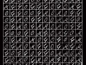
THP: Daniel A. Schulke’s occult herbal The Green Mysteries features your calligraphy, as well as an original set of ornamented capitals you designed especially for the book. What were some of the considerations and inspirations for these letterforms?
 GC: In deciding what would be the overall look of the letterforms for The Green Mysteries, one important point of reference for me was the time period, hundreds of years ago, when knowledge of plants and their uses were much more common. The vast majority of people were rural: living among plants, growing them, gathering them, healing with them, and passing on their knowledge of them to the next generation. And as an aside, it is interesting to note that the average American today can identify only ten plants at most.
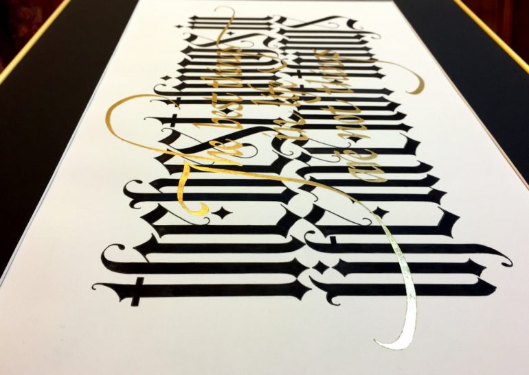
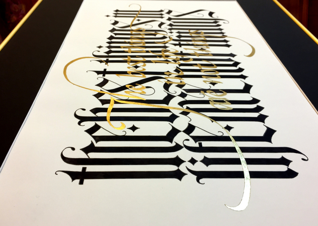
But during that time of in-depth plant knowledge and interdependence with plants — and before the printing press — one of the main handwriting styles was blackletter, which is formed with heavy dark verticals. That was the first decision: heavy dark verticals, which ended up also being more elongated than conventional black letter scripts.
The eventual alphabet was a collaboration between Daniel and me. For the R & D phase, I studied a wide variety of sources, including numerous books and websites and even old certificates and family Bibles that had belonged to my Pennsylvania Deutsch ancestors. I then drew dozens of pages of rough drafts, finally ending up with five styles to offer up for feedback and discussion. And because of the herbal subject of the book, there were also on offer different versions of organic “outgrowths” for decorating the script.
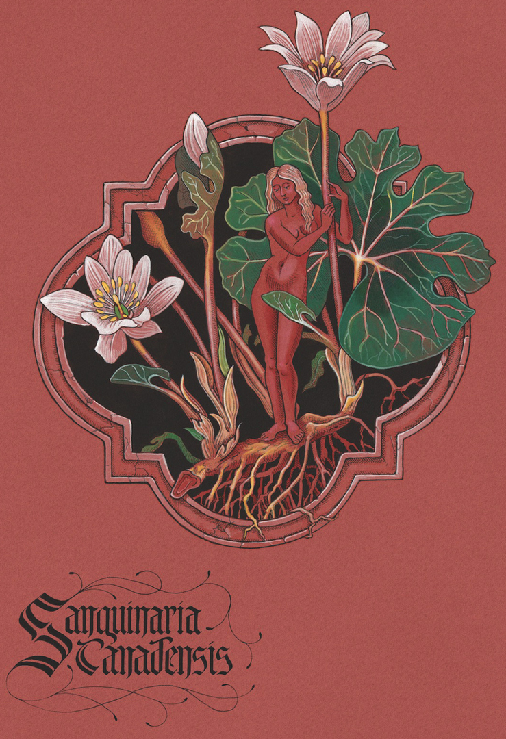
THP: The name given to the set of your unique Green Mysteries letterforms is ‘Black Frond’. Given that the book is about the magical and spiritual properties of plants, this name would seem an appropriate botanical reference. In creating the letters did you draw any aesthetic cues from Benjamin Vierling’s original plant drawings in the book?
GC: Oh, absolutely. My aim was to design a script that would be compatible with Benjamin Vierling’s artwork, and it was his exquisite and sensual herbal drawings that were my inspiration for adding the branching tendrils that sprout from and twine around the letters.
THP: What are some of the techniques you utilize in your work, and are there particular historical examples of calligraphy or letterforms you drawn inspiration from?
GC: The single most inspiring source for me has been The Book of Kells, that wondrous Insular manuscript created in the late 800’s. I actually got to see it in person in the Trinity College Library in Dublin where it is now kept. Surprisingly, what struck me with the deepest awe was when I leaned down to eye-level with the pages and discerned the small indentations made when the scribe gently pressed the inked nib to the calfskin vellum. Every stroke of every letter made its own slight concavity, and it was this very human immediacy that made such an impression on me, over a millennium later.
Another source of inspiration for me came when the art center in Mansfield, Ohio where I was living exhibited a collection illuminated manuscripts. I studied that show for hours and was thrilled to receive from my husband Dave an exquisite leaf from a circa 1470 northern French Book of Hours from the collection. And it was a great honor to me to be commissioned by the art center’s Board to make a scroll to present to the collector to express their gratitude.
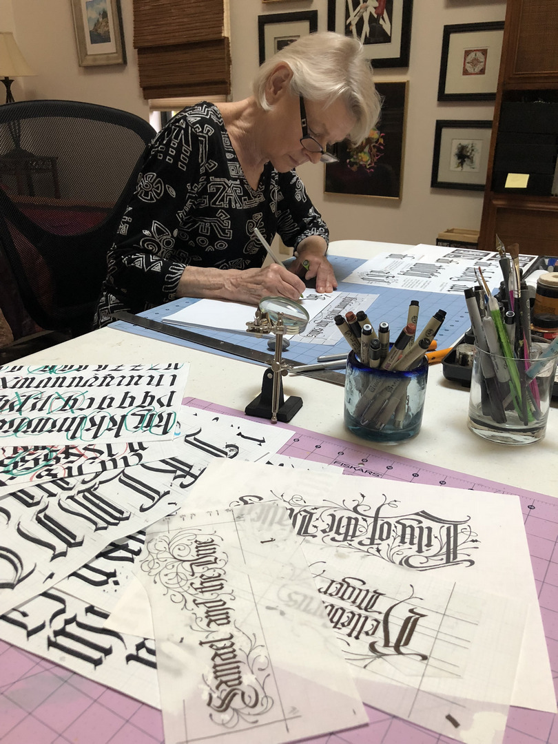
 As to the techniques I employ when creating a manuscript-style carpet page first it is loose scribblings to help me form an idea of the overall shape and dimensions, and since I don’t always have paper on hand, these roughs often happen on a placemat or the back of an envelope. From there I refine my plan on grid paper: the shapes of the calligraphy areas and the places where there will be watercolor miniatures or knotwork or other graphic ornamentation. Many rough drafts later, I transfer the detailed design by rubbing the reverse side of the draft with graphite, then placing it directly on the paper or sheepskin and using a pencil to trace all of the outlines. Then comes the fun part — inking in — and finally adding the color and sometimes gold leaf.
THP: Given the increasing digitization of text in the modern era, how do you see the art of calligraphy evolving?
GC: I think that as the written word continues to become almost exclusively in the form of digitalized fonts, hand-drawn letters will become perhaps even more appreciated for their one-of-a-kind uniqueness and for their human touch. And whereas fonts are designed for uniformity, handwritten scripts allow for idiosyncrasies of positive and negative spacing that can create beauty and visual excitement.
That said, I envision the development of hybrid fonts that will incorporate possibilities for adding decorative strokes and swooping flourishes. It’s an aesthetic enhancement that’s just too good to pass up.
Special Thanks to Kaitlin Coppock for supplemental images.